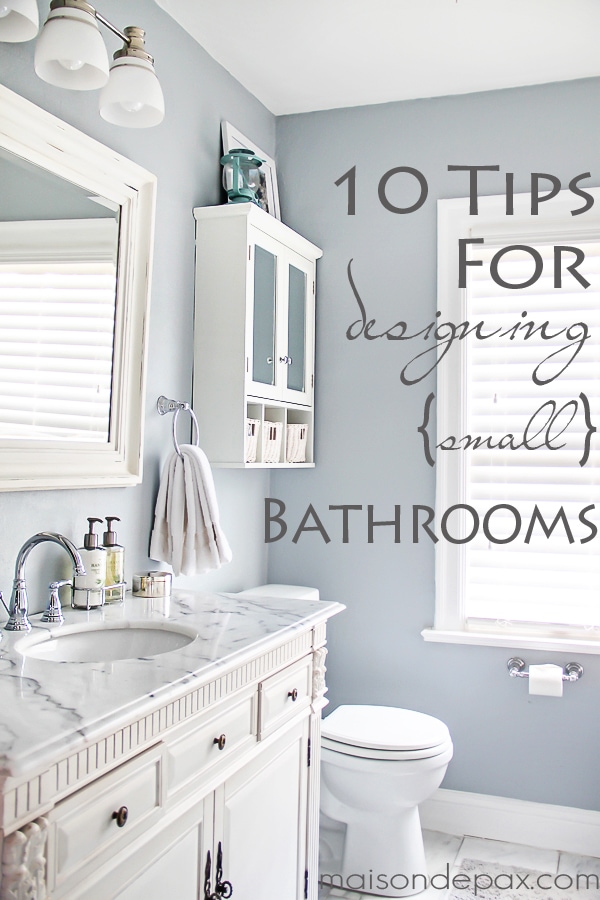
I shared a tour of our new master bathroom last week, and you all seemed to love it! So I wanted to share a few tips on how we got there…
UPDATE: Sources and/or similar products are listed below, but for more details (as well as bonus budget tips!), click here.
First off, I told you I’d share some before pictures. Unfortunately, I didn’t have a wide angle lens at the time, so these are actually from the listing of the house… but trust me when I say that it was WAY worse than it looks:
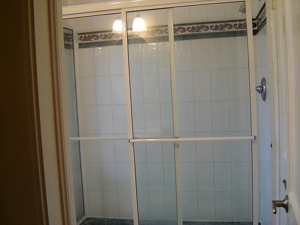
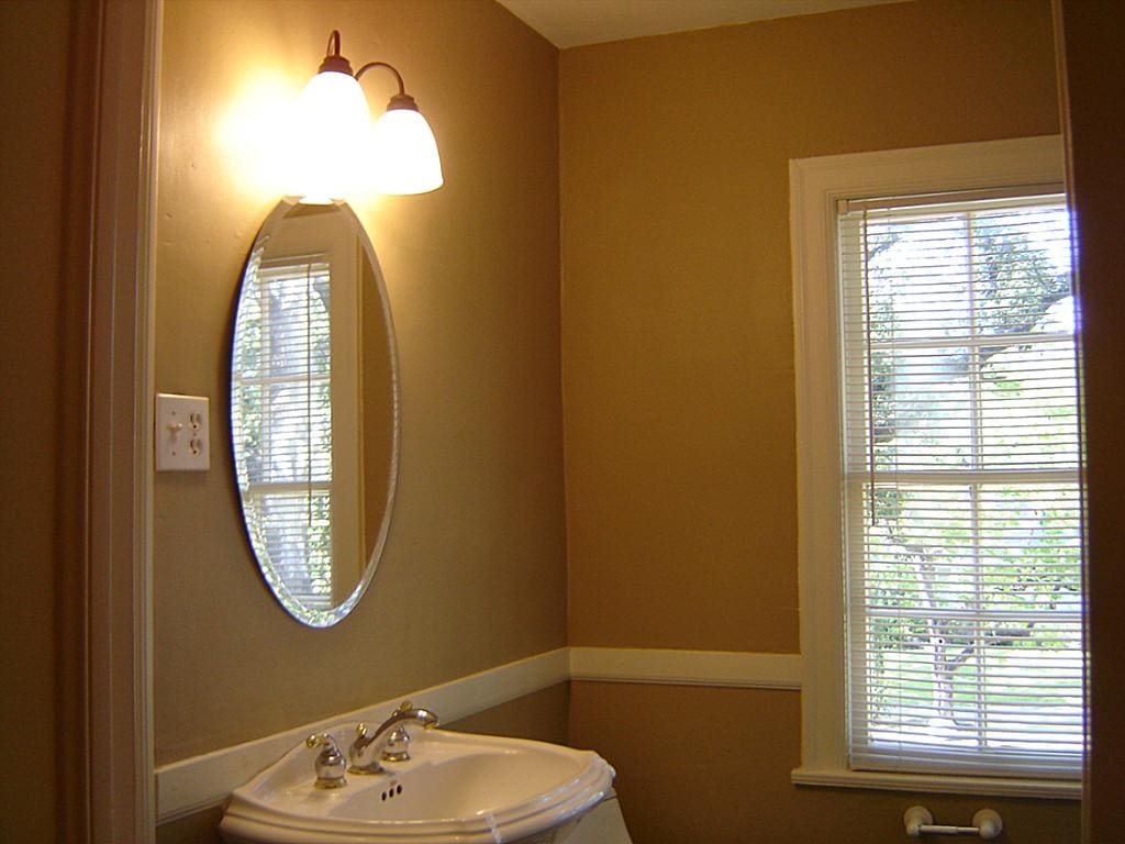
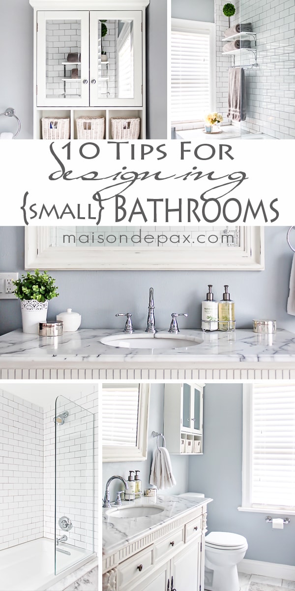
The room is only 6’x7′. That’s pretty small for a master bath, but it doesn’t feel small any more, and I think these are some of the reasons. So, without further ado, here are some suggestions for designing small bath spaces:
1. Use light colors.
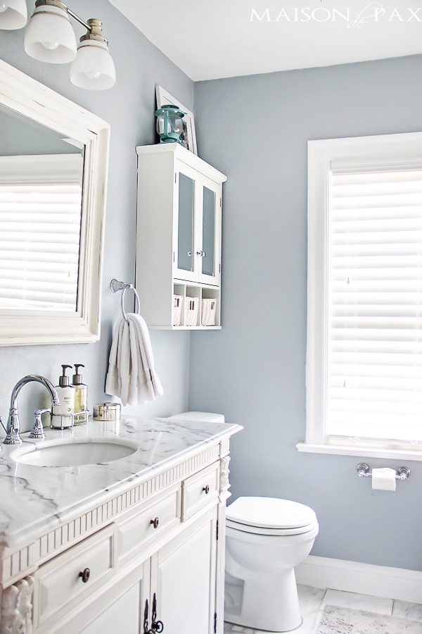
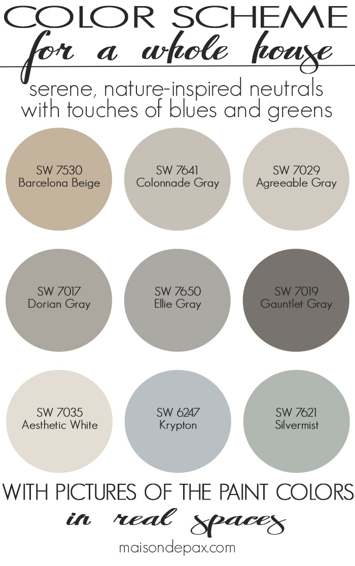
This is one of those go-to design ideas, and I think it’s especially true in a bathroom where you have so many built-in features. The lighter colors open the space and give you room to breathe. (Wall color is Sherwin Williams Krypton.)
This post contains affiliate links for your convenience. Click here to read my full disclosure.
Get the Look:
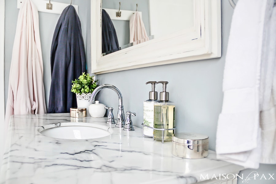
2. Even if there’s room for two, consider a single sink to increase counter space.
We could have just barely fit a 60″ vanity with two sinks, but that would have cut our usable counter space down to the 25″ or so in between the sinks. Instead, we opted for a 52″ vanity that gives us liberal counter space on either side of the sink, allowing us to get ready in the morning at the same time if we want to. Realistically, I think most people use the counter space more than the sink when they’re getting ready. (Note: the vanity we purchased appears no longer to be available, but I’ve linked some similar ones for you above.)
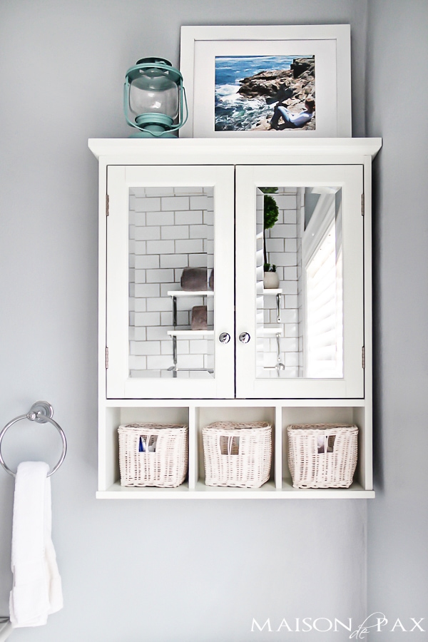
3. Hang a medicine cabinet above the toilet.
I think this is a great alternative to large, built-in cabinetry. A true Johnny cabinet can make the room feel small, and a medicine cabinet above your sink cuts off your personal space (not to mention doesn’t allow you a big, beautiful mirror, which further reflects light and helps your space feel bigger). But a medicine cabinet is the perfect depth to allow decent storage, and above the toilet keeps it out of your way.
Get the Look:
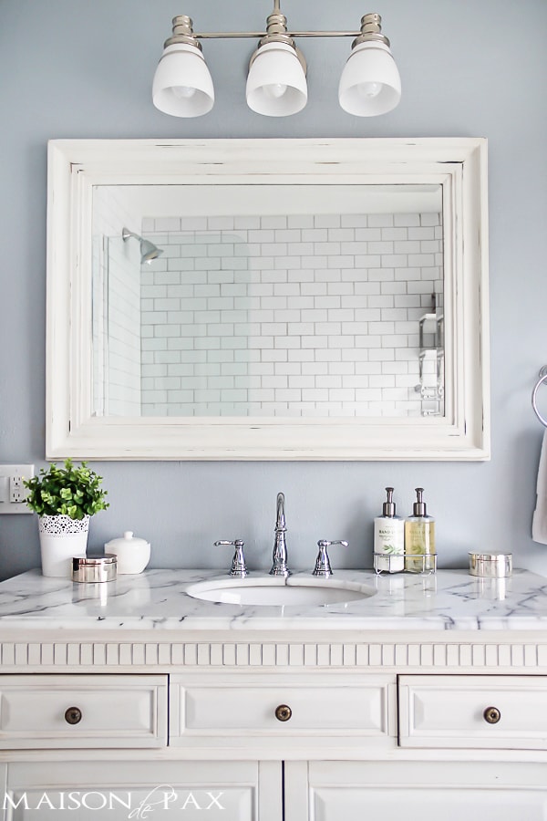
4. Like I just said, mirrors reflect light and make a space feel more open… Use them!
A large one above the sink or a mirrored medicine cabinet is a great way to naturally add to your space.
Get the Look:
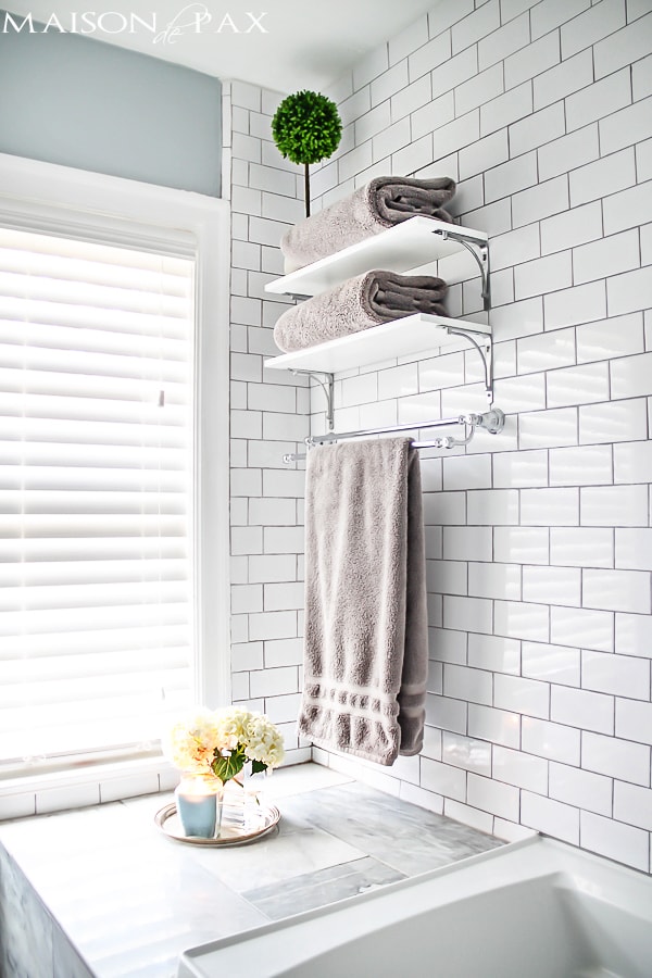
5. Use open shelving to store towels or other pretty essentials.
There needs to be space for towels and toilet paper, and plenty of people have pretty bath salts and such, too. Open storage is perfect for that (we made these shelves simply and affordably using brackets similar to these). There is almost always a spot for a shelf or two, even if a full cabinet wouldn’t fit… And by moving pretty things to the open shelves, it frees up your cabinet space for all those not-so-pretty bathroom essentials.
Get the Look:
6. Create usable space that doesn’t take up visual space with a tub ledge.
Obviously, this is dependent on the layout of your bathroom, but I have found our little half-wall tub ledge (below the shelves above) to be wonderful. It was actually my contractor’s idea, and I wasn’t sure at first because I felt the space under the ledge was “lost” or “wasted.” However, I am so glad we decided to do it. Since the ledge is well below eye level, it doesn’t feel like it takes up space, and it offers a place to sit and/or a ledge for books, candles, or whatever. In a tiny bathroom where a chair is not really an option, it’s nice to have a built-in place to put your shoes on or paint your toenails. Plus, it allows for a double towel bar (which, honestly, in a small bath can often feel like they’re sticking out way too far into the room… this way, it only protrudes above the ledge).
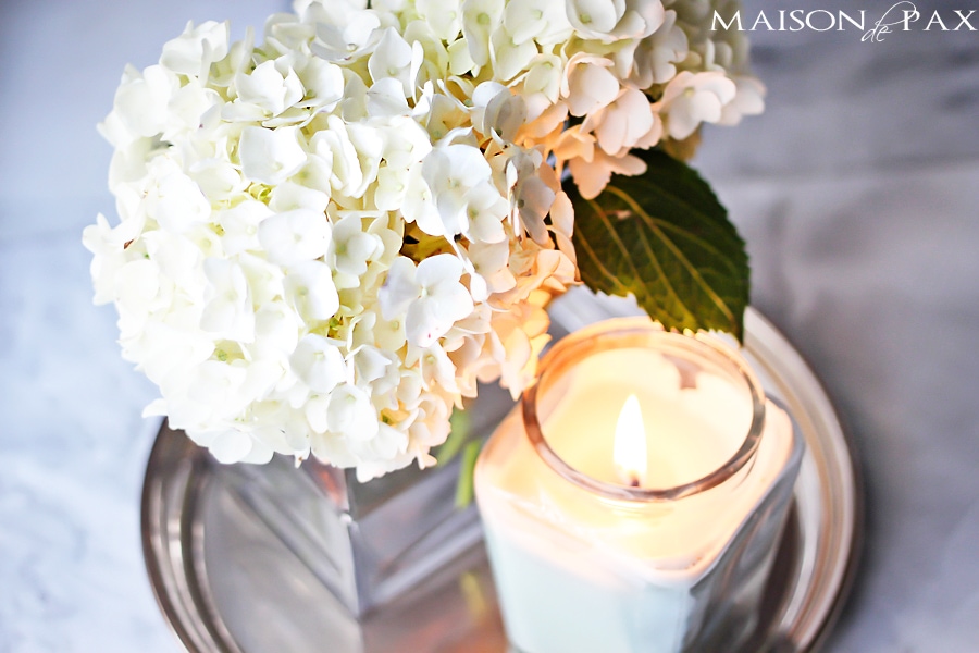
7. Gain tub space and luxury with an extra-deep but normal width soaking tub.
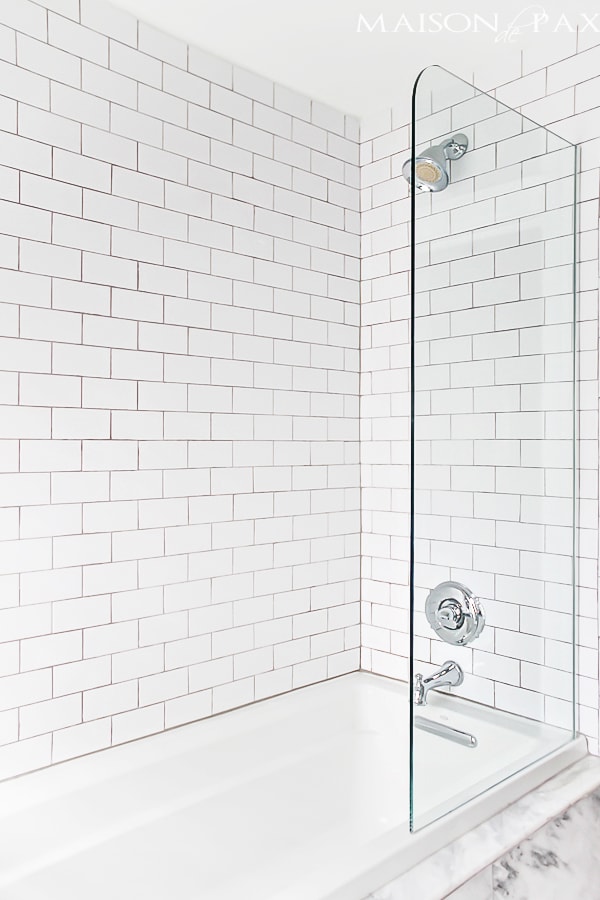
We chose this soaking tub that is 19″ deep but still only 32″ across. The depth provides a luxurious soak without taking up any more precious space!
Get the Look:
8. Minimize visual obstructions with a glass shower wall.
This was hands down our best decision on the bathroom. Our bathroom has a very strange layout (I’m pretty sure it wasn’t a bathroom in the original house plan) with a huge window located as to preclude any chance of a normal, built-in, enclosed tub/shower combo. Which left us either with the option of a curved shower curtain all the way around the tub (which eats up SO much space) or a glass-enclosed tub/shower. Since the previous bathroom had a nasty plexi-glass enclosed shower, I was pretty sure I didn’t want walls like that partitioning off the small room. So we opted for a simple, stationary, glass half wall. We had a similar one in our apartment in Paris, and though there is some spray out of the tub, it is really minimal. We hung the shower head extra high so that it sprays down instead of outward, allowing a bathmat to catch all that matters. I highly recommend this to anyone struggling with space.
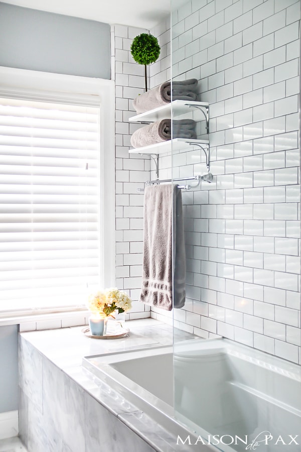
9. Take your shower tile all the way to the ceiling.
In a small space, horizontal divisions can break up your space, making it feel smaller and more partitioned. By taking the tile all the way to the ceiling, it adds a feeling of height and draws your attention away from how close the walls are. And white subway tile is such an affordable, classic option for this look.
10. Keep it simple. You’ll notice that we used only three materials, really: white subway tiles (with gray grout), gray and white marble (we found 12×24 pieces at a local stone yard), and slightly antique white wood. By focusing on quality and simplicity, we were able to make the space feel elegant but not over-crowded.
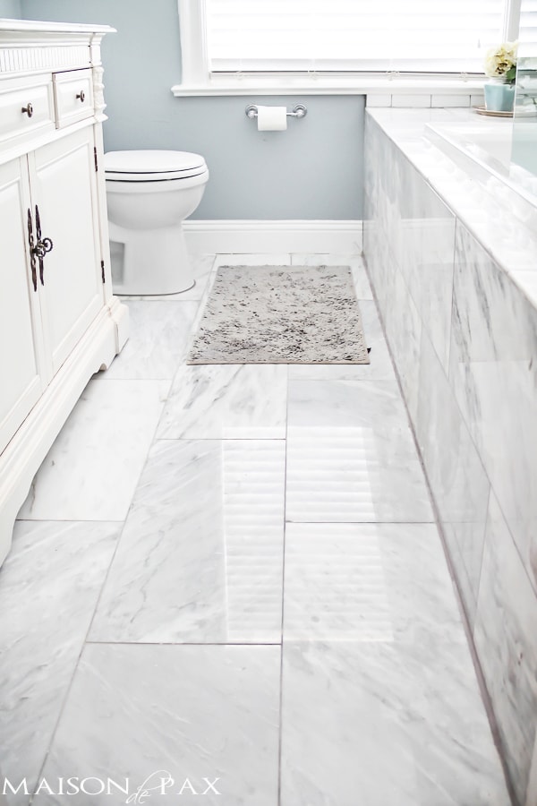
Get the Look:
I hope these tips help in some way! I promise to give a source list soon… UPDATE: Source list and budgeting tips from this remodel now available! Please let me know if you have any questions.
YOU MIGHT ALSO ENJOY:
Original article and pictures take www.maisondepax.com site
Комментариев нет:
Отправить комментарий