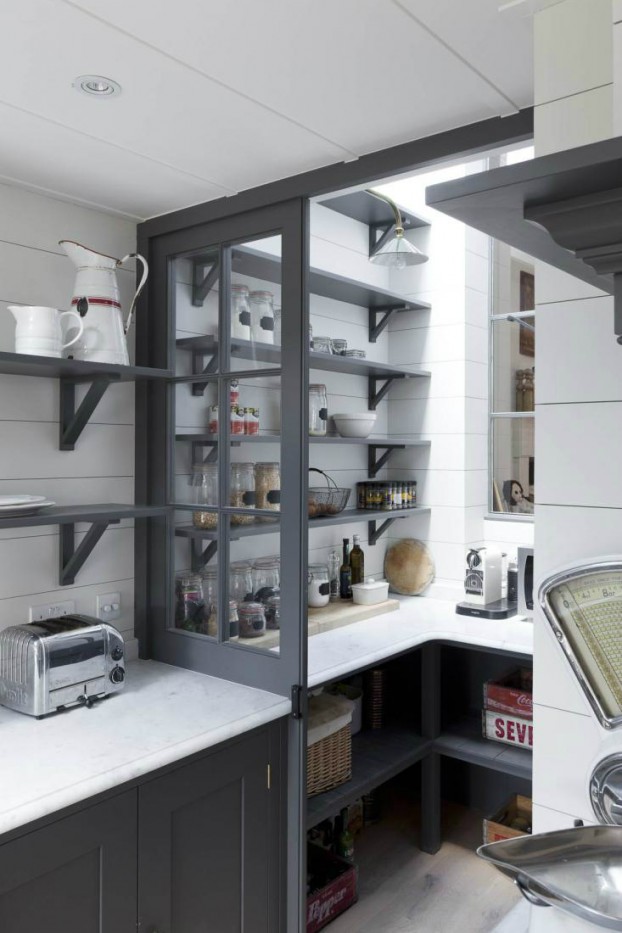
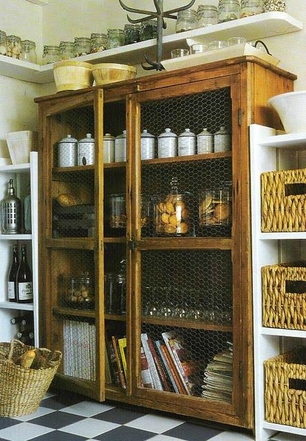
A funny dead space at the end of this kitchen turned into a pantry with a French bistro feel. Photograph by Matt Clayton
A pantry is a great thing to have for kitchen storage, but many people do not make the most of it. It’s often a neglected area of the kitchen with no thought put into its organization whatsoever.
First of all, do not forget it’s a room — albeit a very small room — and like any other room in the house you should really think about the way you decorate and organize the space. As well as thinking about how to get the most out of it.
So let’s look at some kitchen pantry ideas that will help you use the space to it’s full potential.
Lighting.
The very first thing to think about is how well-lit the space is. A pantry can be a dark and foreboding place if it’s dimly lit. Some pantries even have no lighting at all. This is especially a problem if the adjoined kitchen is also suffering from poor lighting. Checking out the labels on cans of soup will be very difficult, it can make it hard to organize and it may even make going in the pantry a slightly unpleasant experience.
Painting the walls white and using white shelving (or a bright wood) will help the light travel around the pantry better and bring light to an otherwise darkened space.
You should also avoid the use of an energy saving lightbulb as they are far too dim for confined spaces. It’s also a problem having a light dangling from the ceiling in what may already be a very limited space. To get around both of these problems, you may want to consider making a false ceiling with plasterboard over a small wooden frame and installing halogen spot lights. These are small, energy efficient, long lasting and are much brighter than the normal lightbulbs or energy saving bulbs that are traditionally used in pantries. It also makes the pantry look more modern and inviting.
Shelving.
It’s important to consider that the pantry is a 3-dimensional space, not a large cupboard. If you’re capable of a little woodwork, you can get your shelving to join together around the corners by cutting it diagonally. This is only an option if your walls are perfectly symmetrical and you’re confident and capable of measuring and cutting wood. Where the shelves intersect, it’s a good idea to use 4 inch long brackets underneath (secured by short screws) to pull the shelves together, and provide extra strength.
Organizing your pantry.
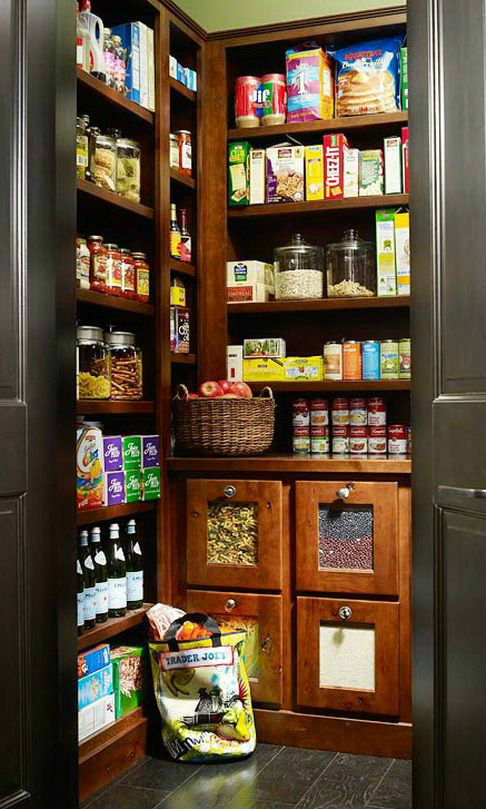
Finally, once you’ve designed the perfect pantry, it’s time to get down to organizing it. Pantry organization is entirely up to you and where you feel certain items should be kept, but it’s important to have it organized in a way where different ingredients and different food types are kept together, otherwise it can get messy rather quickly.
A typical layout would be to have herbs and spices on one wall, canned goods and sauces on another, snacks and cereal on the last wall. It’s a good idea to leave the floor empty to allow you to walk in and use the pantry.
Also remember to cycle your food storage. Meaning that most food (even canned goods) is time sensitive. You should organize your pantry in a way in which the oldest items get used first. A good way to do this is to place newer items at one end of a shelf, and the older items at another end.
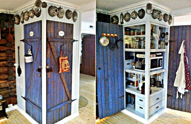
Photographs: Maya Braaten Vardeberg
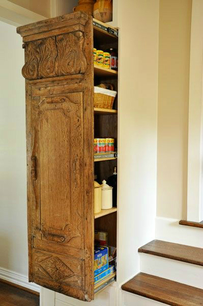
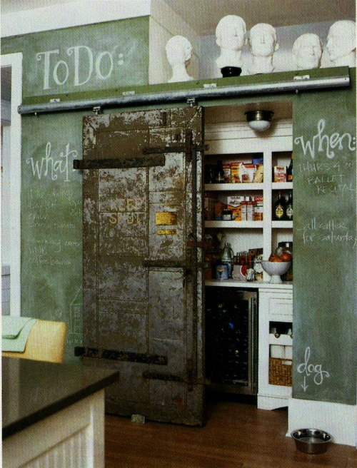
Gorgeous use of architectural salvage for hidden storage by providence DESIGN.
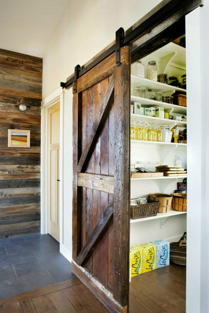
Rustic sliding barn door for a kitchen pantry by Lawrence and Gomez Architects.

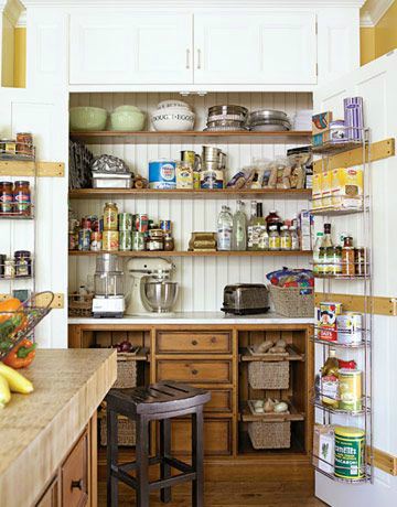
A great idea for combining storage and awork station by Mick De Giulio.
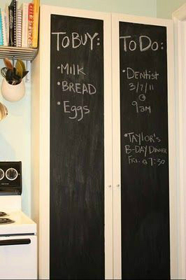
IKEA Billy Bookcase + Chalkboard Paint = Kitchen Pantry
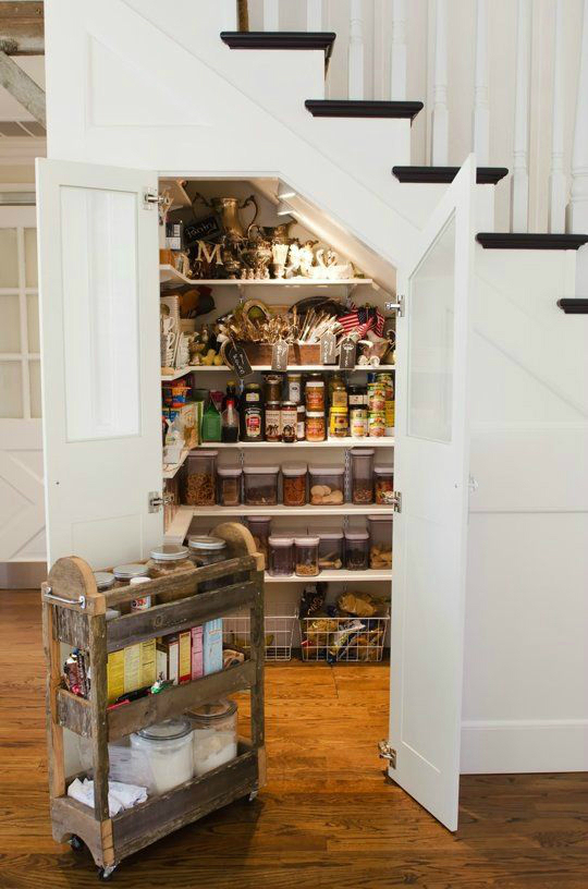
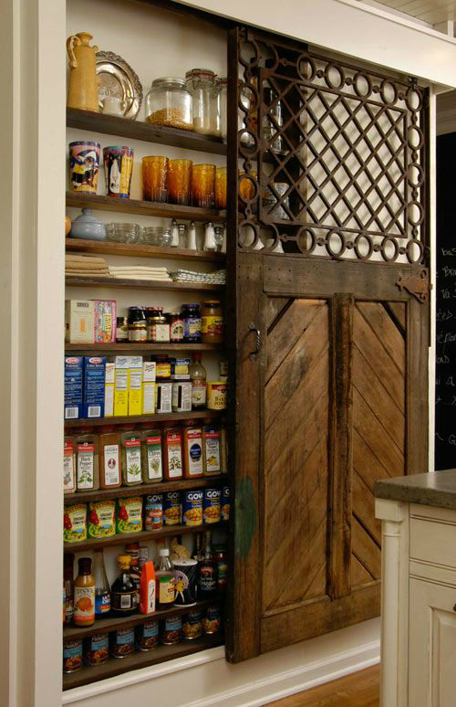
This space is created by opening the space between the studs in the wall. Small, skinny spot, but look at all of the fabulous storage with small pantry items that take forever to find – a great idea byLucianna Samu.
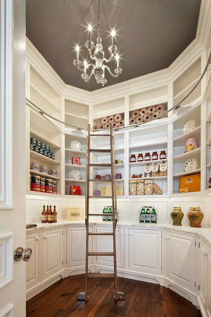
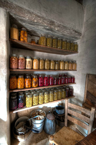
Farmhouse Pantry by Dave Wilson.
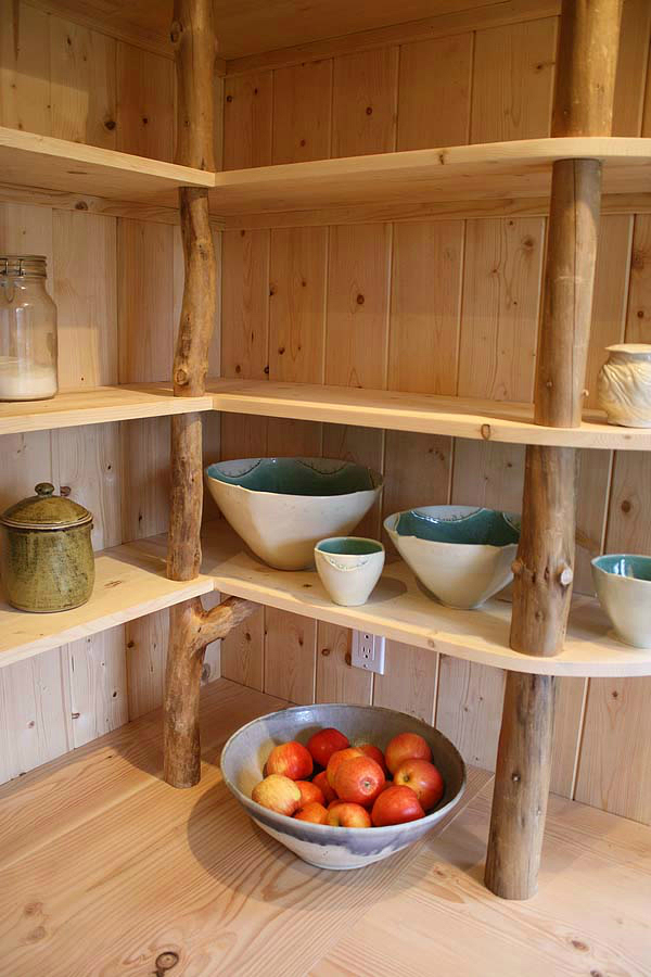
Open shelving with driftwood supports by Horny Island Caravans
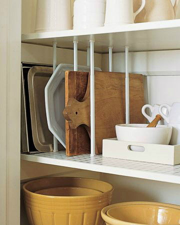
Organize your cookie sheets by using tension rods in the cupboard or pantry.

Hidden pantry by TerraCotta Properties. Great way to make a normally hideous pantry door to look like kitchen cabinets!
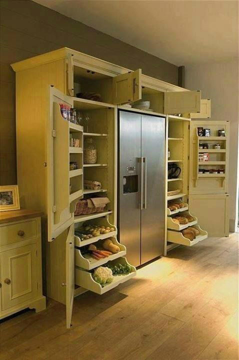
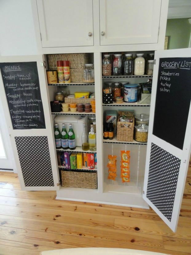
Eleven Magnolia Lane used chalkboard paint, polka dot scrapbook paper, and ribbon. A blackboard behind the doors is a handy place to scribble the shopping list.
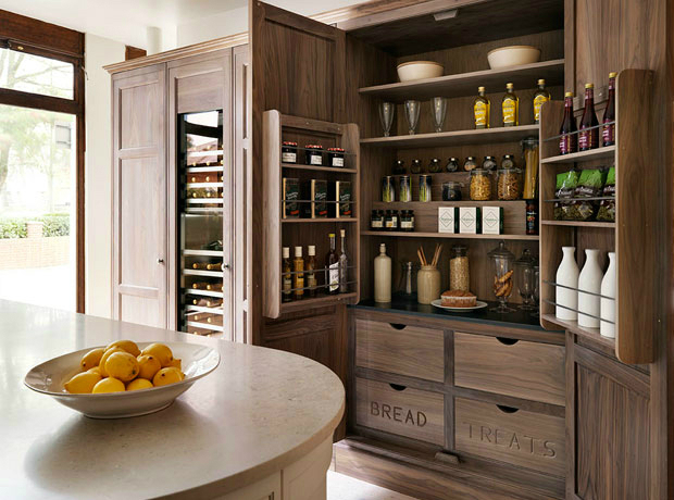
Original article and pictures take decoholic.org site
Комментариев нет:
Отправить комментарий