***Are you on Instagram? I am! I love to share sneak peeks and behind the scenes videos on my Instagram stories! Come join me.***
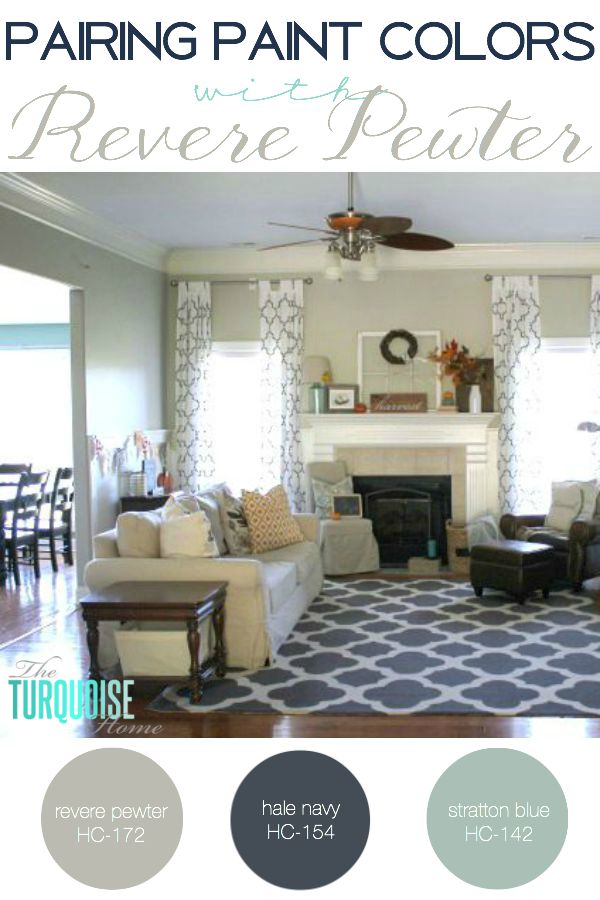
I have finally found the color that I want to paint my open living areas and hallways, and it’s the perfect gray. Woohoo!! But before I tell you which color it is, let’s talk gray for a minute. (And if you like gray, don’t miss the bottom of this post for a link to the colors I love to pair with gray!)

Yes, I know it’s the go-to neutral color right now. It’s sooo trendy, for sure. And I’ve wavered back and forth about whether to stick with beige or go gray. I did beige in my old house, and really liked it fine. It was Latte by Restoration Hardware.

It was a great backdrop for my bright red couch and turquoise accents. And our new home came freshly painted in a similarly neutral beige.
It has a little more red than Latte, but it’s not too orangey for me. But, it’s flat paint. I have no extra sample paint for touch ups and there’s a little girl with sticky fingers walking around this house. So, I needed to paint and pick out a color for my living room, entry way and two hallways.
I finally decided to go with gray because I really want to do something I’ve never done before. (Although I know everyone else is doing it too.) And in two years if I’m tired of it, I can always go back to beige – or some other color. It’s just paint, and I like painting. So there you have it!

Revere Pewter was a little washed out in this picture due to the morning light.
I finally narrowed the selection down to four gray colors. I’ve studied gray paints for hours, looked online, made a long list of possibilities, gone to the paint store and stared at numerous paint chips.

I wanted to try Grant Beige because it seemed to be a nice greige: a mix of gray and beige. But it ended up being way to beige for what I want. I wanted to include some greige colors because my husband really likes the beige and doesn’t seem to love the gray. But he ended up not liking it either. I quickly nixed it from the running and took it down.
The other three colors I really liked. Hazy Skies and Revere Pewter aren’t much different. But the Hazy Skies is just a little more green than Pewter Gray. And then I loved Rockport Gray, but I knew it was going to be dark. I just wanted to try it. My husband really loved the Rockport Gray, but I think once it’s on every wall it would just be too much.
So, which one did I pick??
Drumroll please!

I was leaning toward this color from the beginning, but I just wanted to test it out and give some others a try before I painted it on half of my house.I’ve actually never been so thorough about selecting a paint color before. I usually just look at the paint swatch and go, but this time I decided I needed to put a little more into the process.
And I’m so glad that I did. I now know without a doubt that I love Revere Pewter. And I can’t wait to get it on my walls!
But I have to wait a little bit since my husband’s birthday is this weekend and we’re going to have some friends in town. I don’t want to be in the middle of painting the whole house with company here. Yeah, that might be messy.
I also kind of have a domino effect going on with the living room. I’m definitely doing board and batten treatment on the walls. And so I’ve got to figure out where that’s going exactly.
And I want to paint the top gray and the bottom white before I apply the boards and battens. That way I’m not doing quite as much trim painting as if I did it afterwards. I’m toying with the ideas of some built-ins in the living room as well.
So, I need to figure that out before I do the board and batten treatment. See what I mean about a domino effect? I have to do it all at once, or quickly since each part will effect the other. Whew, just writing it all out makes me tired.
Back to picking paint. I got a little sidetracked and overwhelmed with that last bit. Ha!
I highly recommend taking the time to pick your top favorite paint colors, getting samples, and painting them on poster board. I just used poster board from Walmart and sample paints from Lowe’s tinted to the Benjamin Moore colors.You want the color to be on the wall where you’re going to paint; you can always paint directly on the wall to get an even better idea, but I wanted to be able to take these down, and move them around the house. Check them at different times a day when the light changes in the room.
I also moved these posters to the hallways where there is little to no direct sunlight. I kept a white border around each color on purpose, in order to neutralize the color. I didn’t want the new color to be right next to the original wall color.
Now, while we’re here … let’s take a look at some rooms with Revere Pewter. I can’t wait to have this on my walls!


Now, who wants to come over and have a paint party?!?
You also might like …


Original article and pictures take theturquoisehome.com site
Комментариев нет:
Отправить комментарий